Monday, June 14, 2010

Wednesday, February 24, 2010
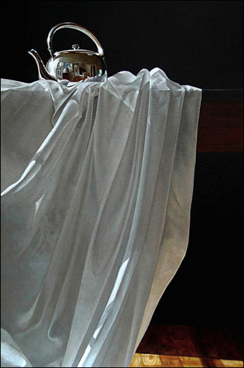
Drapery - How To
Check out these interesting examples:

http://fineartamerica.com/featured/drape-study-i-joanne-hopper.html
or this example of soft edges in color:
 with a discussion of drapery at:

from: http://emptyeasel.com/2007/03/28/realism-in-art-oil-paintings-by-james-neil-hollingsworth/
My point is there is no hard & fast rule for hard or soft edges: it depends on the nature of lighting, texture of the object, etc. Generally, cast shadows create hard edges, ambient and reflected light soft edges, etc. Use your edges plastically to make convincing drapery folds.
artists you may not be familiar with notable painting styles:
American artists:
John Copley (1738), Benjamin West (1738), Gilbert Stuart (1755), J. Sargent (1856), T. Eakins (1844), JK. Currin (1962), J. Schnabel (1951), E. Fischl (1948),
Women artists:
A. Gentileschi (1593), A. Kauffmann (1741), E. V-Le Brun (1755), C. Charpeniter (1767), J. Leyster (1609), J. Saville (1970), D. Tanning (1910)
http://fineartamerica.com/featured/drape-study-i-joanne-hopper.html
or this example of soft edges in color:
 with a discussion of drapery at:
or this one:
 from
from or this one:
from: http://emptyeasel.com/2007/03/28/realism-in-art-oil-paintings-by-james-neil-hollingsworth/
My point is there is no hard & fast rule for hard or soft edges: it depends on the nature of lighting, texture of the object, etc. Generally, cast shadows create hard edges, ambient and reflected light soft edges, etc. Use your edges plastically to make convincing drapery folds.
artists you may not be familiar with notable painting styles:
American artists:
John Copley (1738), Benjamin West (1738), Gilbert Stuart (1755), J. Sargent (1856), T. Eakins (1844), JK. Currin (1962), J. Schnabel (1951), E. Fischl (1948),
Women artists:
A. Gentileschi (1593), A. Kauffmann (1741), E. V-Le Brun (1755), C. Charpeniter (1767), J. Leyster (1609), J. Saville (1970), D. Tanning (1910)
Tuesday, February 23, 2010
Bowls & Strips: The Paper Art of Linda Hagen & Sean Yore - the Exhibit
Bowls & Strips: The Paper Art of Linda Hagen & Sean Yore
21 works of artists Linda Hagen and Sean Yore.
Bowls & Strips – The Art of Linda Hagen & Sean Yore
This collection is an exploration in abstraction with the random textures produced by hand-made papers. We present works that are the intersection of the intentional and planned traditional expression with the unplanned, naturally occurring, randomness of the textures created by the settling of liquid pulp into simple forms. Although the pieces take on conventional forms, the surfaces are suggestive of more imaginative sensations. This is a continuation of the formal properties of the juxtaposition of colors laid over a field of random texture. This would be a post-modernist adaptation of color-field painting. In our opinion, color-field painting is not simply a brief period in American Abstract-expressionist art, but an opening to apply color sensations to contemporary moods.
Now showing at Brisbane City Hall through April 2010
Location: 50 Park Place, Brisbane, Ca.
415-508-2100
Here are pictures of the exhibit:


Sunday, February 21, 2010
Bowls & Strips: The Paper Art of LInda Hagen & Sean Yore - part II - strips
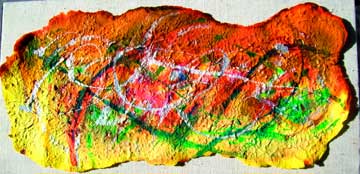
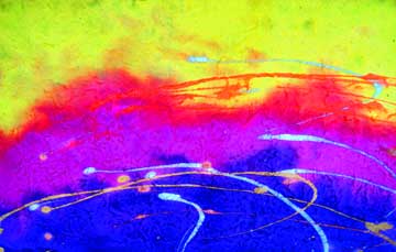
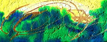

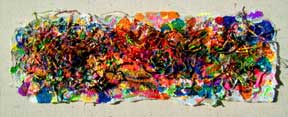
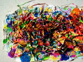 detail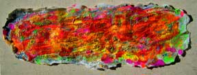
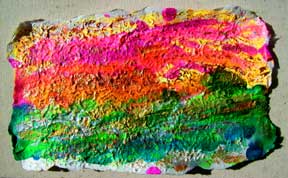
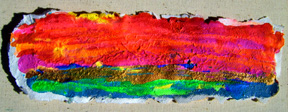

These items are on view at Brisbane City Hall March & April 2010
Bowls & Strips: The Paper Art of Linda Hagen & Sean Yore

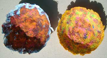

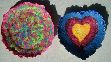

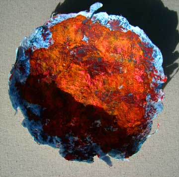
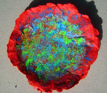
These items are on display at Brisbane City Hall March & April.
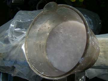
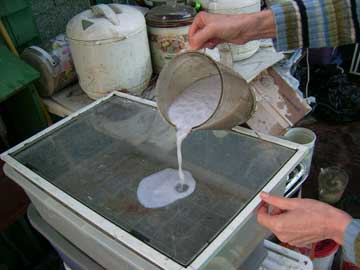
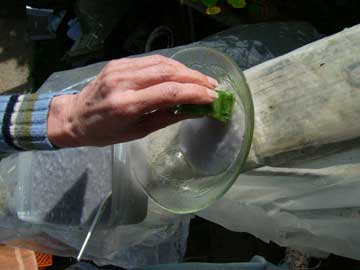
Papermaking - How To Basics
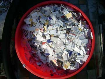
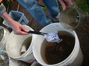
place into a blender

Wednesday, January 13, 2010
still life value study
I selected one of the views of the still life:

This is a view of 4 objects with the background erased. Think of the composition as suggesting the relationship of the statue & the wine. The center of focus is the area between the bottle & glass. Unfortunately the grapes are darker than the the other objects. This may be OK for aerial perspective, but unnecessary in a shallow depth of field.
Lets look at a value study (grayscale). Here are the gray values of the objects. The top of the liquid in the glass is the brightest. The top of the bottle the darkest. The statue, leaves & upper part of bottle (below neck) are about 50% gray. The grapes & tablecloth are approximately 70% gray. If you intend a "low-key" painting, lower brightness of glass and lighten tablecloth (drapery) & grapes. If you intend a "high-key" painting, lighten grapes & drapery. Glass may not need as much darkening because it has more blue.


Now lets look at the green values. The leaves have the lightest green. The statue also has a similar light green component. You can build on this color harmony.

Lets look at the blue values. The glass has the most blue, the bottle the least. A more interesting composition could be achieved by moving the glass closer to the bottle for high contrast OR strengthening the blue saturation of the grapes.

Now, for printing purposes, here are the CYM values of the picture. First CYAN (light blue). Note that CYM colors are subtractive. The lighter shade of gray indicates lower levels of the color. The bottle has the lowest amount of cyan.

Now for yellow. The bottle has the most amount of yellow, the glass the least. Ideal for strong color contrast if you place the items together and increase the yellow & blue saturation.

Now for magenta (similar to alizarin crimson). The leaves & statue have the least magenta, the other objects (including drapery) have a similar amount of magenta. The placement of the objects with respect to this color suggest a weak composition.

Simplify, simplify! Here is an example of a simplification of the objects in the picture. Notice how the objects, although rendered into simple shapes, can be recognized. The overall composition is a collection of colored shapes. The bottle reads as the strongest element, the statue the weakest. We need to adjust the VALUES of the objects according to our strategy (low-key or high key).

Here is my first attempt to adjust the picture for a high-key composition without rearranging the objects. The leaves contrast with the bottle (almost a complementary color). The statue & glass contrast with the grapes (also almost as a complementary color).
I purposely left out the background. Select a color which will harmonize our red-blue pairs; usually a color that has both primaries. Then select a color that will make these objects "pop" (the triad) . This is not an easy choice. For harmonizing color, I suggest a value that is lower (middle tone). For a "pop" efect, I suggest a higher value for the color that is used.
For chiaoscuro, lower values of bottle, grapes & statue and select an even darker background color. Place a brights on the reflection of the glass & fluid.

Lets look at a value study (grayscale). Here are the gray values of the objects. The top of the liquid in the glass is the brightest. The top of the bottle the darkest. The statue, leaves & upper part of bottle (below neck) are about 50% gray. The grapes & tablecloth are approximately 70% gray. If you intend a "low-key" painting, lower brightness of glass and lighten tablecloth (drapery) & grapes. If you intend a "high-key" painting, lighten grapes & drapery. Glass may not need as much darkening because it has more blue.

Lets look at the color levels. This is the red value. For additive colors (RGB) lighter indicates more red. Notice the bottle has the hightest red level.


I purposely left out the background. Select a color which will harmonize our red-blue pairs; usually a color that has both primaries. Then select a color that will make these objects "pop" (the triad) . This is not an easy choice. For harmonizing color, I suggest a value that is lower (middle tone). For a "pop" efect, I suggest a higher value for the color that is used.
For chiaoscuro, lower values of bottle, grapes & statue and select an even darker background color. Place a brights on the reflection of the glass & fluid.
Subscribe to:
Posts (Atom)